
Three characteristics of the icon
First, we need to know the three main characteristics of the (qualifying) icon: shape, visual unity and identifiability. In the user interface design process, these three features are designers need to repeatedly consider. Even when we design a single icon, these three features should also be remembered. Of course, the icon is not just these three features, but these features can help us quickly improve their level of icon design.
Shape
The shape is the basic structure of an icon, the equivalent of the icon skeleton. The main geometric shapes – circles, rectangles and triangles – form the visual basis of icon design.
Visual Unity
The set of elements each one has in a set of icons, we call it the visual unity of icons. These same elements may be fillets of the same radius, line widths (strokes), colors, and the like.
Identifiable
Recognition is the soul of an icon and is the key to making your icon truly unique. Icon is actually a language, its role is to communicate, the difference is that the carrier of information here is not text but graphics.
The success of your icon lies in whether the user can easily decipher your information in a very short period of time. Of course, the recognizable function of the icon is not limited to this. The use of an exquisite element of identifiability links the icons in the whole icon set as a whole, which is similar to the visual unity mentioned above.
Five tips
1.Use the grid
The so-called “no rules, not a radius”, the standardization of the grid icon has a great “constraint” effect, different sizes of grid use and usage are more different. Here, we mainly say that the 32 * 32 pixel grid. We divide the grid into different regions, and different regions play different roles throughout the icon.
First of all, the outermost two-pixel position we usually empty, without anything. The reason for this is to create a sense of space for the icons without overcrowding. We call this area a “blank area.” We call it the “content area” inside.
Circular icons often reach the edge of the content area when they are in the center of the grid, but do not intrude into the white space. Of course, in some special cases, for example, in order to maintain the integrity of the design, and sometimes some of the icons in the secondary elements into the white area is also allowed.
2.Outline
In the initial stages of UI design, we can outline the general shape of an icon by using basic geometric shapes such as circles, rectangles, and triangles. If we draw the outline of the icon directly, then some of the hand-drawn inaccuracies of the icon-making phase will highlight the inaccuracies. Not only that, the use of shape tools sketched out the sketch of the icon in the latter part of the resize will be there. It is true that an icon set is composed of many elements, but the disjunction and non-standard elements will affect the overall quality of the icon set. So sketching the sketches directly with the shape tool can play a role of normalization, ensuring that the icons are accurate to the pixel level.
3.Common design element
Under normal circumstances, 45 ° is a perfect angle. Because the 45-degree angle of the jagged will be uniform into a ladder-like distribution, will not produce blur effect. The icon can be displayed in a clear state, which is in line with the aesthetic needs of the human eye. Of course it is permissible to break this convention in exceptional circumstances. Try using multiples of 22.5 degrees, 11.25 degrees, or 15 degrees.
If you draw the curve is not good will greatly affect the quality of the icon, so from the curve you can see the designer’s skills. The human eye can easily see the subtle differences in the curve, so this is a high demand for designers. We try to use shape tools or numbers to create curves. If you want to solve the problem manually, Adobe Illustrator is recommended, of course, Vectorscribe and Increible can also draw fine curves.
We often encounter in the user experience design process appears jagged edges of the icon, such icons will blur the overall effect. This happens because the graphics do not reach the pixel-level alignment.
Two line width is the most reasonable, of course, in some cases, three are also necessary. The purpose of our introduction of different line widths is to enhance the visual hierarchy and diversity. Too much line width will destroy the consistency of the entire icon set, here refers to more than three. In most cases, we should try to avoid using too thin lines, unless you specifically want to create a set of “linear style” icons.
4.Using a uniform design element
Hemmo de Jonge at Dutch Icon spoke about this at Icon Salon 2015. Hemmo and his design partners added a gap in an icon system project he worked with the Dutch government. Not every icon has this gap, but most are. This approach can be these separate icons organically linked together.
In most cases, even though most of the elements in the icon set have changed, the same design style ties these icons together.
5.Grasp the details of the scale
The details of the icon is not the better, the more detailed the better. Because the main function of the icon is to send information to the user in a short period of time. Too much detail increases the complexity of the icon and affects the recognizability of the icon. Grasp the small details of the scale of the entire icon set of visual unity and recognizability in the important point.
Sum up
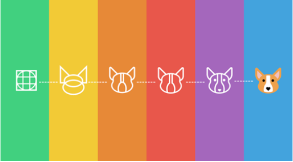
In fact, as long as the practice method is actually more easy to grasp, the difficulty is the change of thinking level. Icon design is a whole to the individual, from shape to recognizable process. Keep in mind that you are designing a complete set of icons rather than an icon, and do not try to be creative in order to catch the eye.
read more: https://uxdesignsg.wordpress.com/2018/01/16/user-experience-consultant-and-agency-in-singapore/
 Learn User Experience Design in Singapore